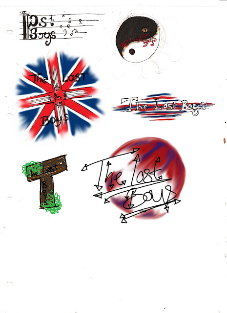
Here I have included my initial design ideas for the logo of the band. Our band name is clearly the lost boys and when creating my logos I was attempting to reflect either the 'lost' aspect of the bands name or the patriotism of the band as a reflection of their ideals. I have also attempted to show that the music is at the core of their ideals in some of the logo designs also.
The first idea makes use of a viola clef which is quite an unknown/unrecognised musical clef, I felt that using this would help to make the band appear more unique and interesting, it would also make the logo look more interesting and definitely show that the music is very important to the band. I feel that though effective this might be too complicated/difficult to read, as such I either need to adjust the idea or disregard it completely.
The second logo on the page is in the shape of the yin-yang symbol for light/dark or good/evil and shows the bands peaceful ideals and their want for peace, To further enforce this I have included the peace symbol. I feel that this helps reflect the bands brand as we want to present them in mod styling and also present them as being very harmonious and at peace with their surroundings. I have use a slightly scratchy font (in its appearance) and feel that thus might reflect the 'lost' part of their name. I feel that this idea is in fact quite effective at what it is doing yet it doesn't reflect the ideals that it should really and as such I am not going to use it in my final design.
The third logo design I have included shows the union jack with music sheets and a heart formed from a treble clef and bass clef. I feel that doing this makes the band appear very patriotic and very much concerned with the music. Showing that the music is at the heart of their ideals and even at the centre of their logo. The font again is quite scratchy in its appearance as a reflection of being 'lost'. I personally feel very happy with this design and would very much like to use this idea, I may however make adjustments in terms of sizing and spacing.
The next logo shows a much clearer and more simple font with the colours of the flag appearing like shards of wood behind the logo as a further suggestion of the band being 'lost'. It also serves to present and enforce the patriotism of the band. This design is only somewhat representative and I feel that it is much less effective on the whole than the other designs that I have created.
The next logo design acts as a clear presentation of the being lost and I felt that a good way of showing this would be through forest/woods imagery, I feel that this has been quite effective in that it does appear to clearly show the idea of being lost. I feel however that the band ideals would be much better to present for the logo and as such I don't think that I will be using this particular design.
My final idea reflects the patriotism more than anything and is much more personal in appearance as the font is intended to look much more like handwriting (and is in fact my own handwriting) and therefore appeal more to the fans as it creates more of a connection. I feel however that this doesn't fully present all that I would like it to nor does it look particularly effective.

No comments:
Post a Comment